

Health and Nutrition
Want Better Sleep? Keep These Colors Out of Your Bedroom
A color psychology expert warns that certain bedroom wall colors can raise your heart rate, trigger stress, and seriously disrupt sleep quality.
- Yitzhak Eitan
- | Updated
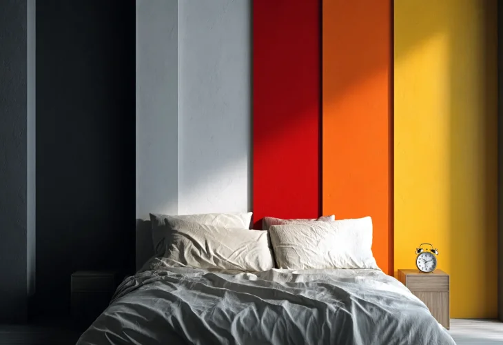
Choosing a color for your bedroom walls may seem like a matter of personal taste, but the atmosphere created by certain shades could also affect how relaxed you feel at bedtime.
Color psychology expert and shade consultant Ali Lees explains that the mood created by a color can influence the body’s readiness for sleep. Research has also explored the relationship between color and emotional responses, suggesting that different colors can influence feelings such as calmness, arousal, and alertness.
So which colors might be best avoided when creating a restful bedroom? Lees points to five shades that may be too stimulating, stark, or heavy for a space designed for sleep.
5 Bedroom Colors That May Make It Harder to Relax
The first is crimson red. Red is a bold, stimulating color often associated with danger, urgency, and strong emotions, making it less suited to the sense of calm many people want before falling asleep.
“Red is known as the worst color for the bedroom,” Lees explains. “It is too stimulating and creates a heightened sense of alertness.”
The second is bright white. Although white is often associated with cleanliness and simplicity, Lees says that cooler, icy whites can make a room feel sterile rather than cozy.
“Although white is perceived as clean, cool, icy shades of white bring to mind a medical, sterile environment,” she explains. “That feeling undermines the cozy, protective atmosphere a bedroom is meant to provide.”
Third is vivid orange. According to Lees, bright orange can create a feeling of vitality and energy, which may not be what you want when trying to wind down for the night.
“If you want to incorporate orange, it is recommended to choose an earthy shade or a soft peach tone, which creates a warmer and more pleasant feeling,” she says.
Another shade to reconsider is glowing yellow. Lees explains that extremely bright or fluorescent shades can feel visually intense and may make a bedroom less relaxing.
“Fluorescent shades strain the eye because of their intense brightness. A powerful yellow can cause restlessness and prevent relaxation in the space.”
Finally, there is black. While black can create a dramatic and sophisticated look, covering bedroom walls in a very dark shade can also make the space feel smaller and more enclosed.
“Black walls can create a suffocating, closed-in, and oppressive feeling, along with negative associations that undermine a sense of calm,” Lees says.
Which Colors Are Better for the Bedroom?
For a more restful atmosphere, Lees recommends three softer alternatives: a warm, muted blue for a peaceful mood; a refined sage green for its connection to nature; and warm taupe, a brown-gray shade that can create a quiet, comfortable feel.
That doesn’t mean you have to eliminate bold colors completely. If you love red, orange, yellow, or black, Lees suggests using them as accents rather than covering the entire room. Pillows, rugs, artwork, and frames can introduce stronger colors without allowing them to dominate the space.
A controlled combination of two or three recurring shades can also keep the bedroom visually interesting while maintaining the calm, comfortable atmosphere you want at the end of the day.

